Way back, when Thyme Out Delicatessen had chickens in the garden, we designed the orginal website. At the time, we were all more than happy with it. It incorporated the chickens in the design. It incorporated nods to the garden in the design. It had a swanky online ordering form for the new catering arm of the business. It was editable, allowing the guys to make updates, such as “Soup of the Day”. But , over time, it started to become a bit creaky and not quite as fit for purpose.


It wasn’t mobile friendly. The chickens had gone to the big coop in the sky, and so the references were no longer relevant. Ben and the team were becoming so busy, as the deli expanded, that the Soup of the Day became the Soup of the Month. The physical deli also underwent a revamp, and became more contemporary with industrial fittings and white decor, meaning that the website wasn’t reflective of the actual business any longer. The website was a little bit too twee and country-cottagey, and perhaps a bit too busy, and so it was decided that the everything brand-wise and online, had to have a revamp too.
First up was the logo – and we took inspiration from the more stripped back, industrial style new interior…
The deli website too, was stripped back, with a less fussy design and with large images, which really did the talking about the Thyme Out Experience.

As the previous website had been labour intensive in terms of updating, we kept this one simple. Menus can be much more easily edited and the gallery is simply the Thyme Out Instagram feed, embedded. A very effective way of quickly updating images. There is also a dedicated page for the brand new catering side of the the business, taking visitors immediately to this site, which we built and designed.

The new website, as with all websites we now design, is mobile friendly and cross tested across all devices and browsers, meaning the user experience is much, much better.

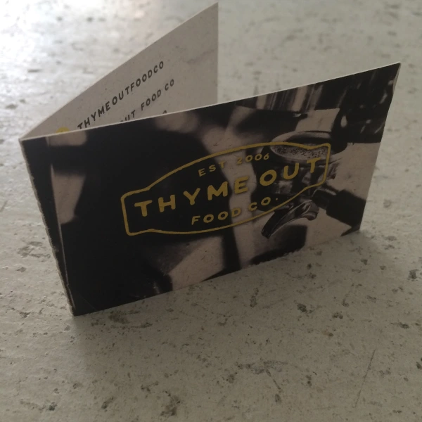
We decided to go a little bit different on the business cards, and rather than the usual front/back design, opted for a gate fold design, on thick, slightly rough, card. Again, reflecting the new industrial interior style.

The guys at Thyme Out Delicatessen, in West Didsbury, have been clients of ours since we started out and we are really delighted to have been a part of their journey and growth, especially taking on the design challenge of a whole new outside catering website. But that’s a whole other blog…
So, over to Ben, owner of both companies, about his experiences of working with us.
We have worked with Pete and Helen at We Are Life Design for a number of years now. They designed our original website for the deli and when we decided it was time to refresh the website, we had no hesitation in going straight back to them. Our deli has developed and evolved over the years and we wanted a more cool, contemporary website and this is exactly what was delivered. We also commissioned We Are Life to design and build a separate website for our catering company – this was a lot more involved, but Pete and Helen ensured that communication was clear and concise and regular, so we always felt involved and in the loop and part of the process. We now have two websites which complement each other and give our company overall a feeling of cohesion. Although Pete & Helen are no longer just around the corner, communication is still very easy and as regular as we need it to be. They are very proactive and swift in responding to any requests we have for changes/updates and also keep us posted with relevant news and information via regular emails which they send to all clients. We feel in safe hands with We Are Life and would not hesitate in recommending them for your design needs.
If you’re contemplating a new website, or a re-design, and you like what you see and read, why not get in touch? It’s what Thyme Out did once upon a time, and look at where we are now.