We get clients in a variety of ways – but never via doing the rounds at breakfast meetings or putting ourselves on random websites which promise to deliver lots of new clients. Breakfast meetings are an absolute oxymoron, as far as I am concerned. If you can’t have breakfast in peace, in the comfort of your own home, then we’re not doing things right. And random websites to generate clients? No, thanks. I’m not wasting my time dealing with enquiries from people who have no clue about us, when I could be dealing with actual clients and genuine enquiries.
The website we originally designed for arts consultant, Paul Clay, came about from a genuine enquiry. We had an offshoot company – a virtual PA strand, which sat alongside our design strand, and Paul was a client. From this, he got to know us and how we worked and so when he decided that he needed a website, he approached us. We were able to discuss his ideas and vision in a clear and focused way, because we weren’t pitching for work. He was already a client of ours and so had already done his homework. This was nearly ten years ago now, and he remains a client. And recently, we have just completed the brand new version of his website, to reflect the projects he is now involved in.
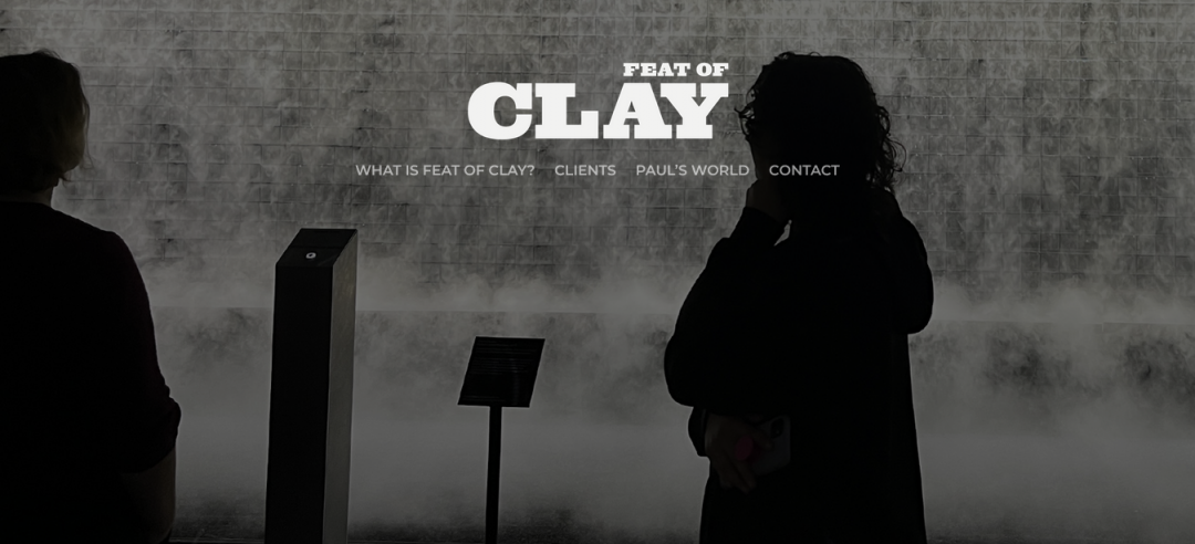
As an arts consultant, working across the world, our client wanted a website which illustrated his work and was representative of him and his company – innovative and contemporary, but not over-the-top and flashy. Working with him, throughout the design process, we achieved exactly what he wanted, because it was a completely collaborative effort. All communications were done via email and phone calls – with both parties never being in the same place at the same time, it was the only way we could realise and deliver the project, but at no point did this way of working cause any issues or delays or tension.
The new website is a simple design, in the less-is-more mould. Keeping with the client’s preferred colour palette, it flows well and looks stylish, without needing bells and whistles to draw/keep the visitor’s attention. Information is kept succinct. Images are bold but few. A simple contact form provides the call to action platform.
This is the kind of project we love to work on. Not just in terms of the actual design work, but because the client is pretty much our kind of perfect client. Communicative, responsive, can provide feedback (both good and not so good), has a positive outlook, has a vision but is prepared to take advice and look at alternative options. Is generally just an all round, nice person. Who wouldn’t want to work with clients like this?
And this takes me back to where we started. Frenzied breakfast meetings, chucking out business cards to anyone who’ll take them. Listings on websites which promise to deliver the earth but actually deliver nothing but entirely unmatched and unsuitable clients, because there’s no real filtering process. We actively avoid these kind of scenarios/situations because they are pretty soulless – and instead, get to know our clients in a much more in depth way, knowing that if someone asks them if they know of anyone who can deliver their design project, our names will probably be put forward. And, we also know that before any contact is made with us, potential clients will have done their homework on us. A great situation for us – if they do come to us, and we proceed, excellent. If they have done their homework and decide we’re not for them, and don’t get in touch, that’s not a problem. We’ll probably never find out anyway, so no disappointment.
Anyway, do your homework. Investigate us – look into our portfolio, read our blogs, check out our social media, speak to any of our clients. However you do it, just do it. Paul did, and over then years later, we’re still going strong.