I need to incorporate the design so that everything is in one place, rather than two separate sites and would maybe like to re-launch in the new year, to mark ten years since I started postnatal exercise classes…
Claire, the founder of For Baby and Me, contacted us via our design enquiry form, and this was the start of a very lovely relationship. Originally with two separate websites, she was finding that as the business grew in reputation and client numbers, things were beginning to become a little more confusing. The two sites were overlapping and Claire felt she needed a much more clear focus so that she could develop her brand more effectively and more easily convey the nature of her business – post-natal exercise classes, primarily aimed at new mums who wanted to get fit after the birth, but also including new classes aimed at new dads and partners, who wanted to learn baby yoga techniques in a hands-on way.
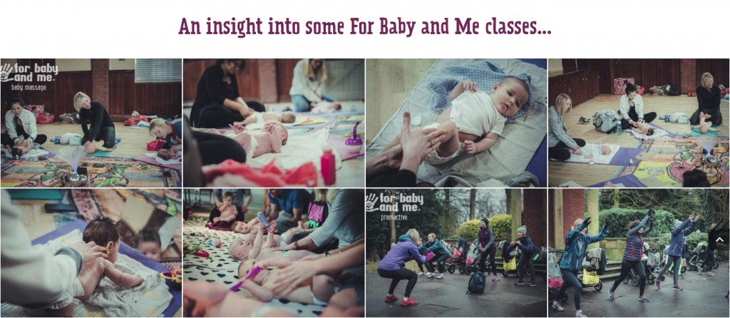
The brief was to design a website which would be more user friendly and with a simple integrated registration system. We felt that a website which promoted outdoor activity would benefit from a professional photo-shoot, of actual participants, rather than going down the stock imagery route, which we always encourage clients to try and avoid. Stock imagery has its place, but often isn’t an authentic representation of the business. Claire took this advice on board, and although a photo-shoot wasn’t initially included in the original budget allocated to the project, we were able to look at costings to enable it to go ahead. Great photography meant we had a fantastic starting point for our design – and enabled us to much more effectively convey the nature of the business in a visual way.
Class information was simplified and displayed in a clearer format, ensuring that visitors to the site found what they were looking for, quickly and easily. We’re great believers in “less is more” and so if appropriate, encourage keeping copy succinct, but with obvious means of contact, so that if more information/clarification is required, the means of getting touch are clear. As the business, and therefore the website, is aimed at parents of babies, we didn’t want the design to be too formal or corporate. However, we also didn’t want it to look unprofessional or too “homemade” and we think a good balance was struck with the Lunchbox Light font and the contrasting font colours, sitting on the signature purple background. As well as the navigation arrows, we used a scroll bar, to create a one page website, again ensuring that the site was easy to navigate. As with all of our websites, it’s now standard practice to test across all devices and browsers to ensure that they are mobile friendly – it’s a lot more time consuming for us than it used to be in the days when one size almost fit all, but it’s definitely worth it when you know that a visitor will have a pleasant browsing experience, whatever device they are viewing on. And if a website is easy on the eye and well designed and informative, we know it’s much more likely that visitors will connect with the business.
A horizontal scrolling gallery was added, incorporating more of the in-situ photography, which really showcase the essence of the classes and give a good indication of the experiences. And, of course, permissions were sought and granted, from all who were photographed!
We were delighted that we were able to mark the tenth anniversary of this community focused South Manchester fitness business which really is going from strength to strength – and we think that Claire is delighted that she made the leap from her two separate websites, to a much more streamlined online presence…
I first met Helen a few years ago and immediately liked her! I knew that if I was to pay for a web designer to update my business website I needed to know the person and feel they would ‘get my business’ and the client group that I work with.
It was therefore a no-brainier that I would chose Helen and Pete at We Are Life Design. Right from the start I was in the driving seat, I decided on how much I had to spend on the website, the look and content and at every stage I could review, tweak and sometimes start-again! But what I loved was that Helen and Pete offered advice on a new colour scheme, updated logo and suggested professional photography – these were aspects I never expected to get, so the finished result is the content I wanted plus the sleek look I could never have achieved on my own. I would have no hesitation in recommending We Are Life Design to any business and Pete and Helen have continue to offer support going forward. Plus I feel I’ve joined a great local community of We Are Life Design clients. Thank you!
If you too are considering a redesign – or a brand new website – why not get in touch like Claire did? We’ll be very clear and very honest about what we can do for and will always try to deliver something you will be very proud of, whatever your budget. You can email us via the Design Enquiry Form on our own website, or send your initial enquiry via the form below.
We’d love to hear from and help make your design dreams come true!