Lindsay is another client we’ve not actually met before, in person. She is based in Switzerland, but came to us via another client, Claire Jones, who is an old friend. As a health coach, Lindsay came to us as she did not have a website and with a growing business, she felt that the time was right to become prominent online and have a site to which she could direct people. She did have a logo, but was happy for this to be worked on, so that it would complement the design of the website.

Threaded through everything we do, design-wise, is the concept of collaboration. Unless a client explicitly tells us that they have absolutely no ideas and would prefer to just leave things to us, we always work with you, so that you have ownership of the design. You know your business much better than us, and will generally have a good idea of what it is you want to achieve – and this is how things started with Lindsay. Ideas were presented and changes were made – colour variations, orientation, font style and size etc – until the new logo was fine tuned and agreed up on.
![]()
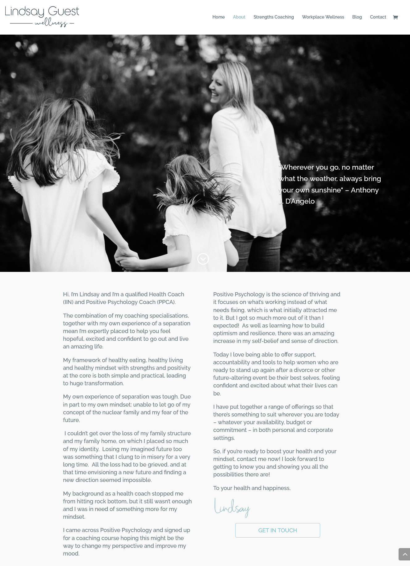
We always, always try to get clients to consider professional photography for their websites. We know that cost is a consideration, but honestly, professional images make a world of difference. We really try to avoid stock imagery – whilst much of it can be beautiful, there’s nothing worse than seeing a carefully selected image, turn up on another website. Thankfully, Lindsay did enlist a professional and we think that the imagery really does enhance the website.
Because of the nature of the work that she does, we agreed that the design needed to be light and uncluttered, with white space, creating a feeling of calm. Soft blue tones were introduced and the the simple, but classic Raleway family of fonts were used across the site.

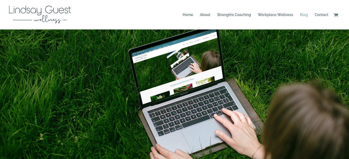
The homepage is an appealing mix of static and animated images, which provide an alternative way of navigating to other parts of the site. Other pages are a mix of black and white colour, and a blog facility was added, so that Lindsay could keep her clients and visitors up to date with latest news and trends, within her field.
Throughout the process, we kept in regular touch with our client. Designing during a lock-down had its challenges, but fortunately for us, communication wasn’t one of them. Because we are now based in Istria, not Manchester, and have been for nearly four years, we’ve had to really focus in on how we communicate with clients. Phone calls and emails are obviously a big part of our day, but Zoom meetings have now come to the fore. With Lindsay, we were able to work on the designs in real time, as suggestions were made and changes implemented. Sometimes these calls lasted up to three hours – intensive, but we figured, no more so than previous face to face meetings. I think a Zoom meeting also focuses the mind more, too – sitting in front of a screen generally means that the time spent on the call is productive and positive. We also found that we worked more steadily, not stopping so often for coffee breaks etc.
The website has now launched, but that is not the end of things with our client. We are always on hand to tweak, post launch – and if the changes are small and manageable, we would never charge for these. Obviously, for more detailed, in depth changes, we do charge – but additional costs are always discussed before any further work is undertaken. We have continued to work with Lindsay – and will continue to do so, for as long as she requires our design help. Because we don’t just build websites. We build relationships.
And, if we sound like the kind of people you might like to work with, just drop us a line…