It was probably in 2015 when Claire Currie, founder and owner of For Baby & Me, came to us to redesign her website. She wanted to develop her brand and put herself and her business on a more professional footing. This we did, designing a more “serious” looking website, with a change of colour palette, introducing more purple tones – although retaining the original branding (not designed by us), as the budget wasn’t available for this to be tackled at this stage. The colour of the logo was changed however, bringing in a softer mauve tone and changing the background from black to white.
![]()
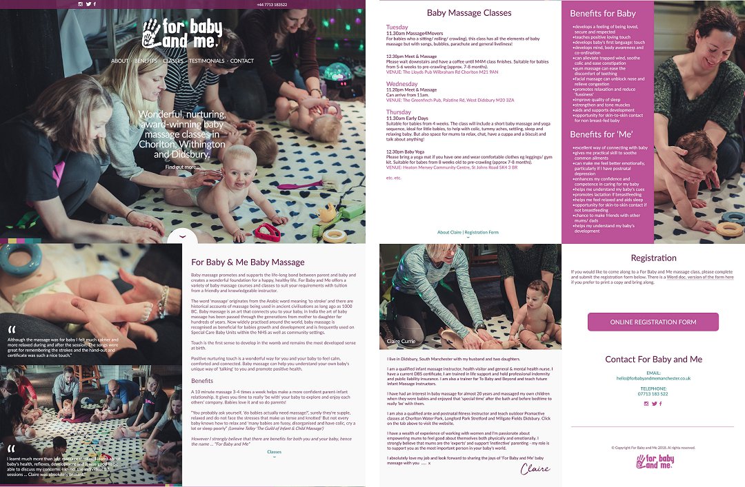
This iteration of the website worked well and the business grew and developed, as Claire hoped it would. We cannot take credit for this – Claire is an exceptional practitioner in her field and her reputation grew, bringing more clients. However, a more serious, professional online presence does help, as it affords validity to a business, so the changes made, were a factor in the growth.
However, as businesses grow and develop, often what was absolutely right at the outset, becomes outdated or not quite right any longer, and this happened with For Baby & Me. So, in 2022, we embarked on the third iteration of the the website. Original photography, taken by a professional photographer, always enhances a website and always gives us the opportunity to be more creative. Whilst stock imagery can be appropriate for certain styles of websites, imagery which focuses in on the products or the people or the outcomes of the business, are always more authentic – and Claire understood this, so had one of her parent and baby exercise classes professionally shot. We think the results speak for themselves.
In terms of the new design for the website, we kept the same one-page format, using the new imagery. Whilst designing, it quickly became apparent if we were going to be introducing a lighter colour palette, as had been agreed, now was a great time to introduce a new brand for For Baby & Me. The icon of the hand and the font and the colours were just not working, and with Claire, we worked together to produce a new logo, using a much more friendly font (Pacifico) including a new B “icon” for the word “baby”, with a chick safely cocooned within. Reinforcing the whole ethos of the business.
![]()
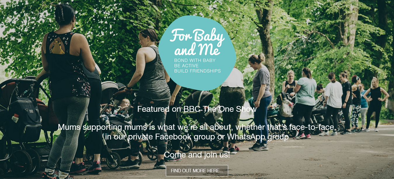
To maintain some continuity with the previous website, the original purple colour was used for sub-headings, but the overall feel of the site was softened with the introduction of the duck-egg blue colour. The real photography runs seamlessly through the site, lending real authenticity and giving the website vibrant personality.
In the future, the website may change again, but we feel that with this version, For Baby & Me has really grown up and entered a different phase, enabling the business to be showcased to its very best.